
In today’s fast-paced digital world, the way people shop has fundamentally changed. Gone are the days when consumers would sit at their desks to browse online stores. Instead, they’re scrolling through product pages on their smartphones while waiting in line, relaxing on the couch, or even during their commute. This shift in consumer behavior has made mobile optimization not just a nice-to-have feature but a critical component of e-commerce success. If your online store isn’t optimized for mobile, you’re leaving money on the table—plain and simple.
Let’s dive into why mobile optimization is so important and how it can make or break your e-commerce business.
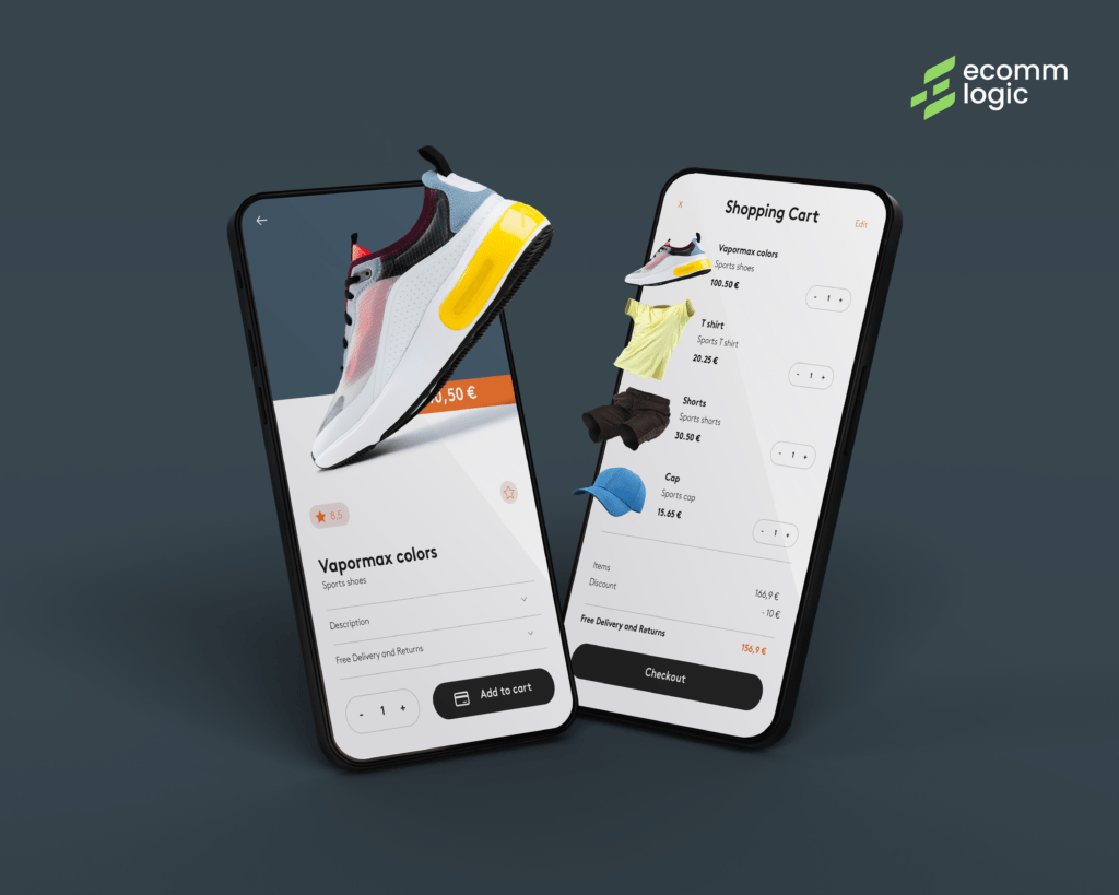
1. The Rise of Mobile Shopping
Mobile devices have become the primary way people access the internet. In fact, over 60% of global web traffic now comes from mobile devices. For e-commerce, this trend is even more pronounced. Studies show that mobile commerce (m-commerce) accounts for nearly 73% of total e-commerce sales worldwide.
Think about it: smartphones are always within arm’s reach, making it easier than ever for consumers to shop on the go. If your website isn’t mobile-friendly, you’re essentially shutting the door on a massive portion of your potential customers.
2. First Impressions Matter
Imagine clicking on a website from your phone, only to find tiny text, misaligned images, and buttons that are impossible to tap. Frustrating, right? Most users will abandon a site within 3 seconds if it doesn’t load properly or isn’t easy to navigate.
A mobile-optimized site ensures that your customers have a seamless experience from the moment they land on your page. This means fast loading times, responsive design, and intuitive navigation. A positive first impression can turn a casual browser into a loyal customer.
3. Google Loves Mobile-Friendly Sites
Search engine optimization (SEO) is a key driver of e-commerce success, and mobile optimization plays a huge role in it. Google uses mobile-first indexing, which means it primarily uses the mobile version of your site to rank pages. If your site isn’t mobile-friendly, it’s likely to rank lower in search results, making it harder for potential customers to find you.
By optimizing your site for mobile, you not only improve the user experience but also boost your chances of ranking higher on Google. And higher rankings mean more visibility, traffic, and ultimately, sales.
4. Enhanced User Experience Drives Conversions
A well-optimized mobile site isn’t just about aesthetics—it’s about functionality. Features like one-click purchasing, auto-fill forms, and mobile-friendly payment options (like Apple Pay or Google Wallet) make the checkout process quick and effortless.
When the shopping experience is smooth and hassle-free, customers are more likely to complete their purchases. In fact, 53% of mobile users will abandon a site if it takes more than 3 seconds to load. Speed and ease of use are non-negotiable in today’s competitive e-commerce landscape.
5. Mobile Optimization Builds Trust
A professional, mobile-friendly website signals to customers that your business is credible and trustworthy. On the other hand, a poorly optimized site can make your brand appear outdated or unreliable.
Trust is a critical factor in e-commerce, where customers can’t physically interact with products before buying. By providing a polished mobile experience, you reassure customers that they’re making a safe and secure purchase.
6. Social Media and Mobile Go Hand in Hand
Social media platforms like Instagram, TikTok, and Facebook are major drivers of e-commerce traffic. These platforms are predominantly accessed via mobile devices, and many users discover products through social media ads or influencer recommendations.
If your site isn’t optimized for mobile, you risk losing out on this valuable traffic. A mobile-friendly site ensures that users who click through from social media have a seamless shopping experience, increasing the likelihood of conversion.

7. Staying Ahead of the Competition
The e-commerce space is more competitive than ever. With so many options available to consumers, businesses need to go above and beyond to stand out. Mobile optimization is no longer a differentiator—it’s a baseline expectation.
If your competitors are offering a superior mobile experience, customers won’t hesitate to take their business elsewhere. By prioritizing mobile optimization, you not only meet customer expectations but also position your brand as a forward-thinking leader in your industry.
How to Optimize Your E-Commerce Site for Mobile
Now that we’ve established why mobile optimization is crucial, let’s talk about how to achieve it:
- Responsive Design: Ensure your site automatically adjusts to fit any screen size.
- Fast Loading Times: Compress images, minimize code, and leverage browser caching to speed up your site.
- Simplify Navigation: Use clear menus, large buttons, and easy-to-read fonts.
- Streamline Checkout: Offer guest checkout options and integrate mobile payment solutions.
- Test Regularly: Use tools like Google’s Mobile-Friendly Test to identify and fix issues.
The Bottom Line
Mobile optimization isn’t just a trend—it’s a necessity for e-commerce success. By providing a seamless, user-friendly experience on mobile devices, you can attract more customers, boost conversions, and stay ahead of the competition. In a world where convenience is king, a mobile-optimized site is your ticket to thriving in the digital marketplace.
Ready to take your e-commerce business to the next level? Visit ecommelogic.com for expert insights, tools, and strategies to optimize your online store for mobile and beyond.
Let’s build the future of e-commerce together!