
When I started working on WordPress websites, I used to believe that design was everything. The more stylish the layout looked, the better the website would perform. But after working on multiple projects, one thing became clear. Good design alone does not bring results.
I saw websites that looked average but generated leads daily. At the same time, some beautifully designed sites struggled to get even a single inquiry. That is when I understood that conversion is not about appearance. It is about how easily a visitor understands your message and takes action.
If you want to build a high-converting WordPress website, you need to shift your mindset. Instead of asking “Does it look good?” start asking “Does it guide the user?”
The Moment a Visitor Lands on Your Site
Think about your own behavior when you visit a website. You do not read everything. You scan quickly. Within a few seconds, you decide whether to stay or leave.
Your visitors do the same.
If your website does not make sense instantly, they will not give it another chance. This is why the first screen matters so much.
Instead of writing long introductions, focus on clarity. A simple headline that explains what you offer can do more than a paragraph full of fancy words.
Why Simplicity Wins Every Time
One of the biggest mistakes people make is trying to add too much. More sections, more animations, more features. It feels like you are improving the website, but in reality, you are creating confusion.
A simple layout works better because it reduces effort for the user.
When everything is clear, users feel comfortable. When they feel comfortable, they stay longer. And when they stay longer, the chances of conversion increase.
You do not need to impress visitors. You need to make things easy for them.
Understanding What the User Wants
Visitors do not come to your website to admire your design. They come because they want something.
Maybe they are looking for a solution. Maybe they are comparing options. Maybe they are ready to buy.
Your job is to remove friction from their journey.
Ask yourself:
What question is in their mind right now?
Then answer it clearly on your page.
When your content aligns with the user’s intent, everything starts to work better.

The Role of Structure in Conversion
A good website feels like a guided path. Each section leads to the next without confusion.
Instead of randomly placing content, think of your page as a flow.
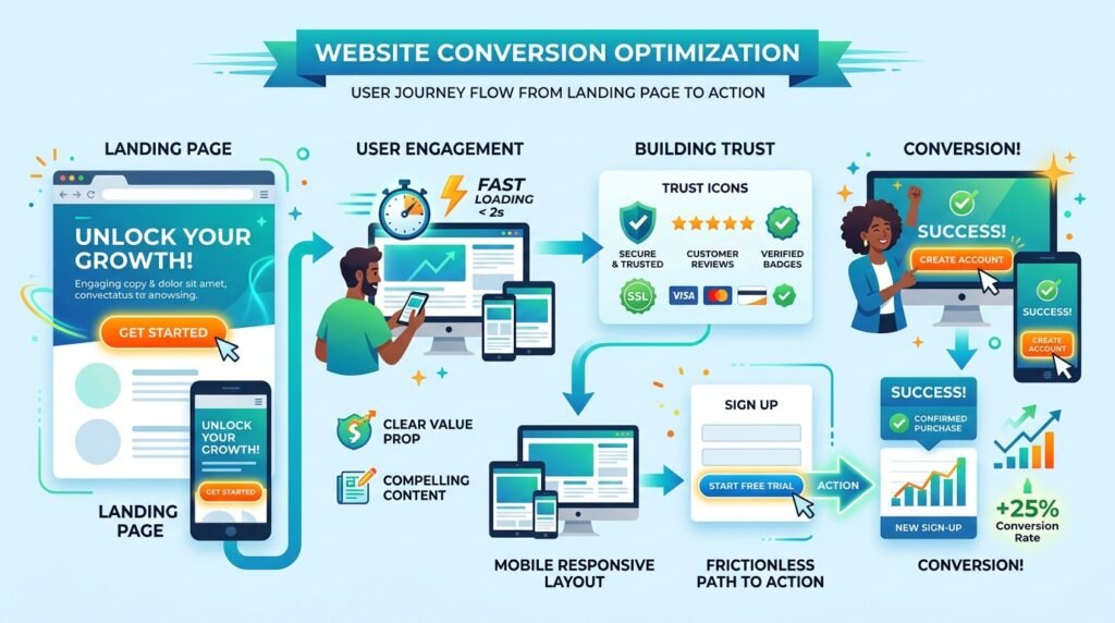
Start with a clear message. Then explain the value. Then build trust. Finally, ask for action.
When information is structured properly, users do not feel lost. They move forward naturally.
Small Details That Build Trust
Trust is not built through big claims. It is built through small details.
When your design is consistent, your spacing is balanced, and your content is clear, it creates a sense of reliability.
Adding real elements like customer feedback, contact information, and transparent policies strengthens that feeling.
People notice these details, even if they do not consciously think about them.
Why Many Websites Fail to Convert
After working on multiple projects, I noticed a pattern. Most websites fail for similar reasons.
They try to say too much at once
They focus more on design than clarity
They ignore how users actually behave
They copy others without understanding why something works
These mistakes are common, but they are also easy to fix once you recognize them.
Making Actions Feel Natural
A visitor should never feel confused about what to do next.
If you want them to contact you, make that option visible. If you want them to buy, make the process simple.
The key is to guide without forcing.
When actions feel natural, users are more likely to follow through.
Mobile Changes Everything
There was a time when websites were mainly designed for desktops. That is no longer the case.
Now, most users are on mobile devices. This changes how your design should work.
A layout that looks perfect on a large screen can feel broken on a small one.
This is why you should always check how your website feels on a phone. Not just how it looks, but how easy it is to use.
Speed Is Part of the Experience
Even before users read your content, they experience your website speed.
If it loads quickly, everything feels smooth. If it is slow, frustration begins immediately.
Speed is often ignored, but it plays a direct role in how users perceive your website.
A fast site feels professional. A slow one feels unreliable.
Learning From Real Interaction
No matter how well you design your website, there is always room for improvement.
The best way to improve is by observing how people actually use your site.
Where do they stop scrolling? Where do they leave? What do they click?
These small insights can help you make better decisions.
Instead of guessing, you start improving based on real behavior.
Final Thoughts
A high-converting WordPress website is not built through trends or complicated design techniques. It is built by understanding people.
When your website is clear, simple, and easy to use, visitors feel confident. And when they feel confident, they take action.
You do not need to be perfect. You just need to be clear and consistent.
That is what makes the real difference.
Need Help With Your Website
At Ecommelogic, we focus on building WordPress websites that are designed around user behavior. The goal is not just to create something that looks good, but something that actually performs.
If you want a website that brings real results, the right approach can take you much further.